Color is not just beautiful to look at. It can have an impact on how you feel too. In this article, let’s look at the psychology of color and which colors to use for your desired mood.
“The deepest and truest secrets of color effect are invisible even to the eye and are beheld by the heart alone”
Johannes Itten
Isn’t color just the most wonderful thing? Doesn’t a place look that much nicer when you add a bit of color?
Have you ever thought about the psychology of color though?
The psychology of color
Color can really influence your mood. And as such you can use it as a tool to influence it. We tend to pick our clothes each morning for the mood that we are in.
If I am feeling particularly happy I will normally choose something colorful to wear. And if I”m feeling a bit down, I will probably want to hide a bit from the world and would go for something black.
But what if you did the complete opposite?
How to use the psychology of color?
Instead of choosing the color matching the mood that you are in, go for a color that will enforce the mood that you want to be in.
I know that this can be very hard to do. if you are feeling depressed, it’s not easy to appear happy or to wear happy colors. But if you are determined to not let that depressive mood get the best of you and rule your day, try to do it anyway.
Go for something with yellow instead of the all-black outfit. It is very hard to keep feeling depressed or sad when you are wearing yellow. Just like it is very hard to feel depressed if you stand up straight and hold your head up high. You may like to check our guide on how to wear yellow.
Let’s look at what effect specific colors have on you, so you can pick the right color for the mood you want to be in.
For lots more ideas on how to wear color, check out our color guides!
Also, if you want to know which colors uniquely suit you, also check out our color palette guides. You will find a unique capsule wardrobe for each color type.
Get the details on spring, summer, autumn, and winter.
Black
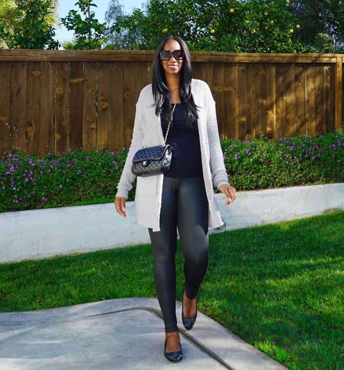
Black is the color of authority and power, stability and strength. It is also the color associated with intelligence (think of the black robe you wear at graduation).
It’s a somber color sometimes associated with evil.
In the western hemisphere black is associated with grieving. Black is a serious color that evokes strong emotions; it is easy to overwhelm people with too much black.
Wear it to feel powerful or mysterious.
View all our tips on how to wear black over 40.
White
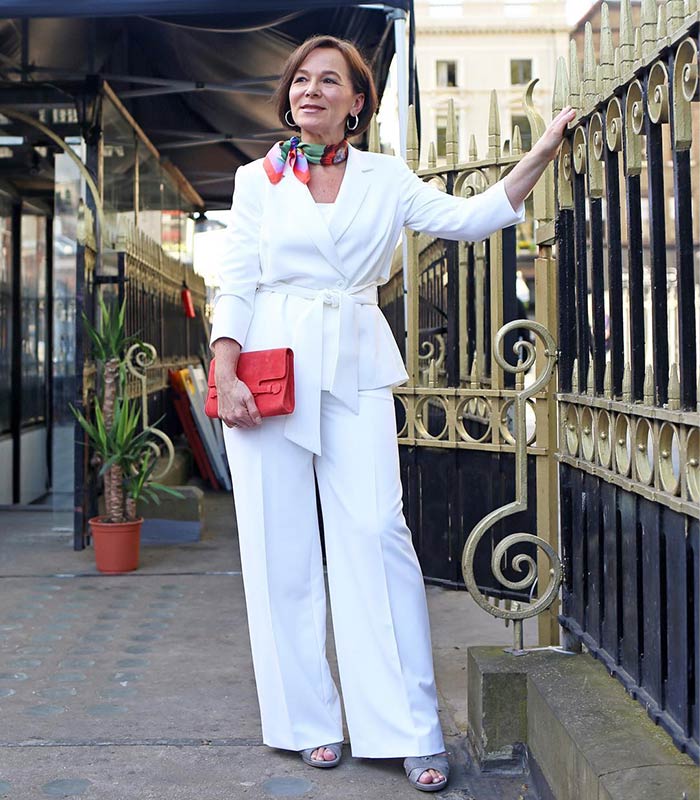
For most of the world this is the color associated with purity (wedding dresses); cleanliness (doctors in white coats) and neutrality. In some eastern parts of the world, white is associated with mourning. White is associated with creativity (white boards, blank slates).
Wear it for more mental clarity.
See all our best tips on how to wear white.
Gray
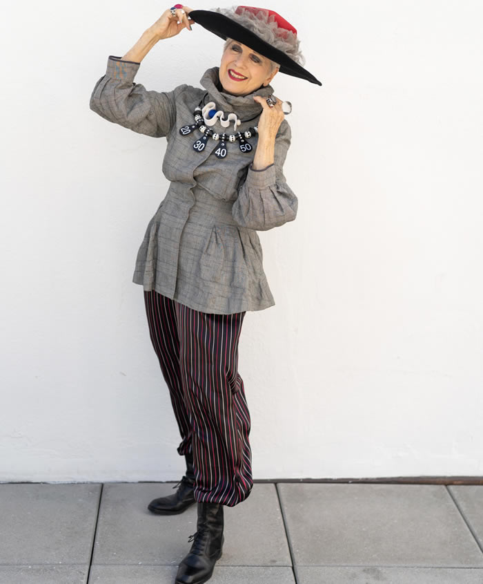
Gray is mostly associated with the practical, timeless, middle-of-the-road, solid things in life. Too much gray leads to feeling mostly nothing; but a bit of gray will add that rock solid feeling.
Some shades of gray are associated with old age, death, taxes, depression or a lost sense of direction. Silver is an off-shoot of gray and often associated with giving a helping hand and strong character.
Wear it to feel more solid.
For more tips see our article on how to wear gray
Red
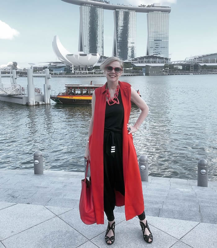
Red is the color of energy. It’s associated with movement and excitement. People surrounded by red find their heart beating a little faster.
Red is the symbol of life and, for this reason, it’s the color worn by brides in China.
Red is used at holidays that are about love and giving (red roses, Valentines hearts, Christmas, etc.)
Wear red when you want to have lots of energy and confidence.
For more tips and inspiration see our article on how to wear red.
Pink
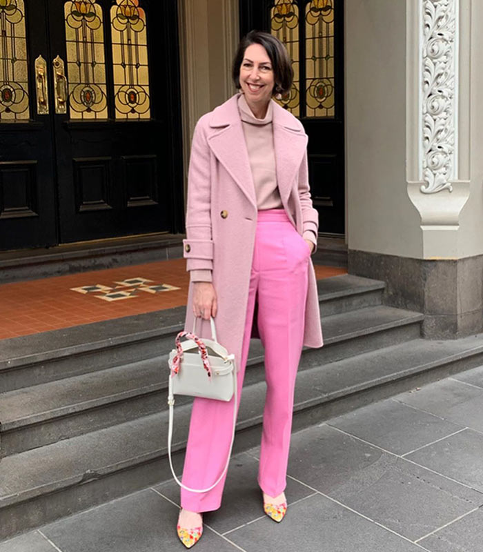
Pink is the true color of love . Pink is the most calming of all colors. Think of pink as the color of romance, love, and gentle feelings, to be in the pink is to be soothed.
Wear pink to feel more loving.
For more tips and inspiration, check our tips on how to wear pink.
Blue
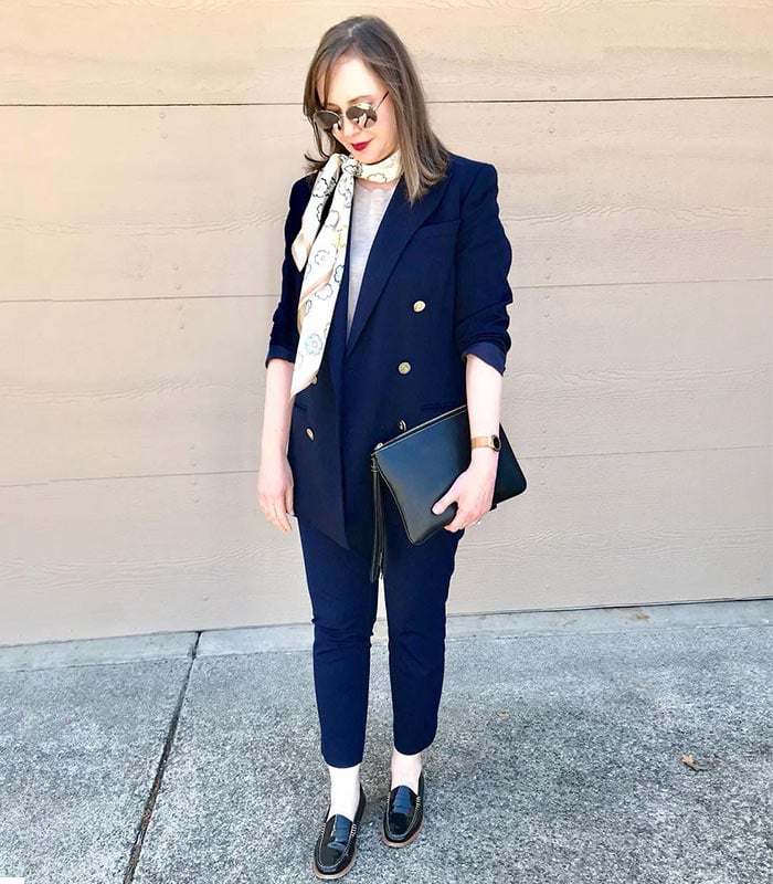
Blue is a a calm and restful color. Seeing the color blue actually causes the body to produce chemicals that are calming. However, some shades (or too much blue) can send a cold and uncaring message. Over the ages blue has become associated with steadfastness, dependability, wisdom and loyalty (think of the many blue uniforms). People tend to be more productive in a blue room because they are calm and focused on the task at hand.
Blue is good to use when you want to calm yourself or be more intuitive.
For more tips and inspiration check our tips on how to wear pale blue and how to wear navy blue
Green
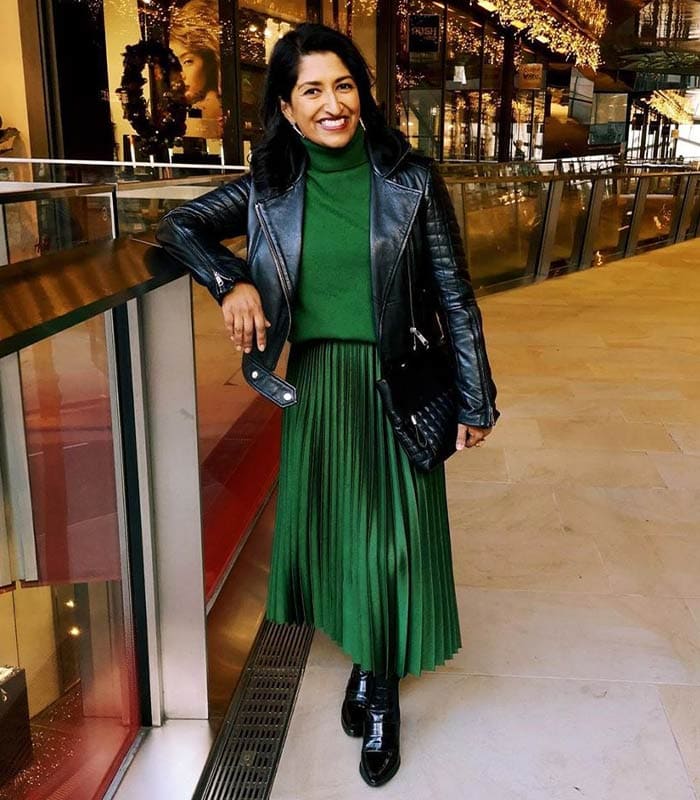
The color of growth, nature, and money. A calming color also that’s very pleasing to the senses. Dark forest green is associated with terms like conservative, masculine and wealth.
Hospitals use light green rooms because they too are found to be calming to patients. It is also the color associated with envy, good luck, generosity and fertility. It is the traditional color of peace, harmony, comfortable nurturing, support and well paced energy.
Use green to feel more relaxed and ease your anxiety. If offers a sense of renewal and harmony.
For more inspiration and tips see our article on how to wear green.
Yellow
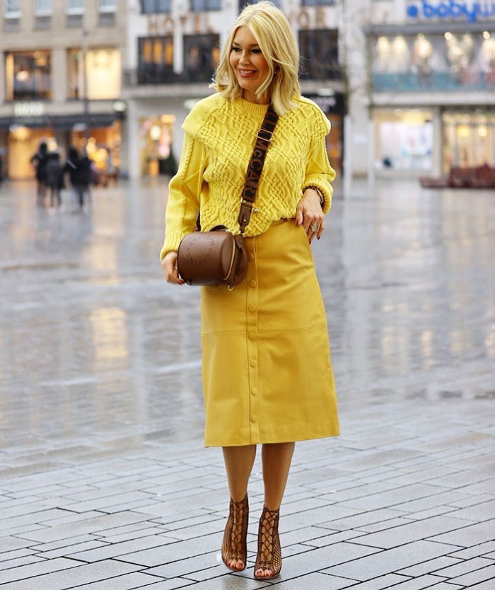
Cheerful yellow is the color of the sun, associated with laughter, happiness and good times. A person surrounded by yellow feels optimistic because the brain actually releases more seratonin (feel good chemical in the brain) when around this color.
It is the color associated with optimism. It has the power to speed up our metabolism and bring out some creative thoughts. Some shades of yellow are associated with cowardice; but the more golden shades with the promise of better times.
Wear yellow to feel more optimistic, mentally stimulated and creative.
For more ideas and inspiration check out our article on how to wear yellow.
Orange
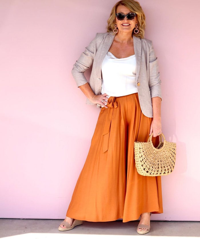
The most flamboyant color on the planet! It’s the color most associated with fun times, happy and energetic days, warmth and organic products. It is also associated with ambition. There is nothing even remotely calm associated with this color. Orange is associated with a new dawn in attitude.
Use orange to stimulate activity and socialization.
For more tips and inspiration, see our article on how to wear orange.
Purple
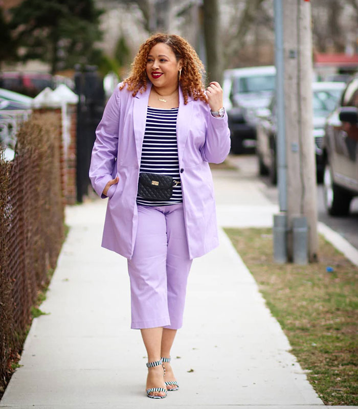
Purple is royalty. A mysterious color, purple is associated with both nobility and spirituality. It stimulates the brain activity used in problem solving. However, when overused it is associated with putting on airs and being artificial. Use purple most carefully to lend an air of mystery, wisdom, and respect.
Wear it to feel spiritual, calm and creative.
More inspiration and ideas in our article on how to wear purple.
Brown
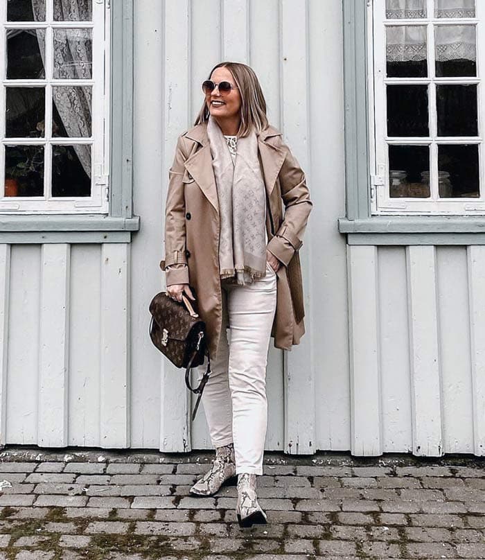
This color is most associated with reliability, stability, and friendship. It’s the color of the earth itself. It is also associated with things being natural or organic. In India, however, it is the color of mourning.
Use it when you want to feel wholesome and stable.
Think of color and the psychology of color as another tool you can use to influence how you feel. When used effectively it can really brighten up your day.
If you like to play more with color, you can also check out color lovers.
“Colour is a means of exerting a direct influence on the soul. Colour is a keyboard, the eyes, the hammers and the soul is the piano with many strings. The artist is the hand which plays, touching one key or another purposively to cause vibrations in the soul.”
Wassily Kandinsky
Have you ever considered the psychology of color? What effect do colors have on you?
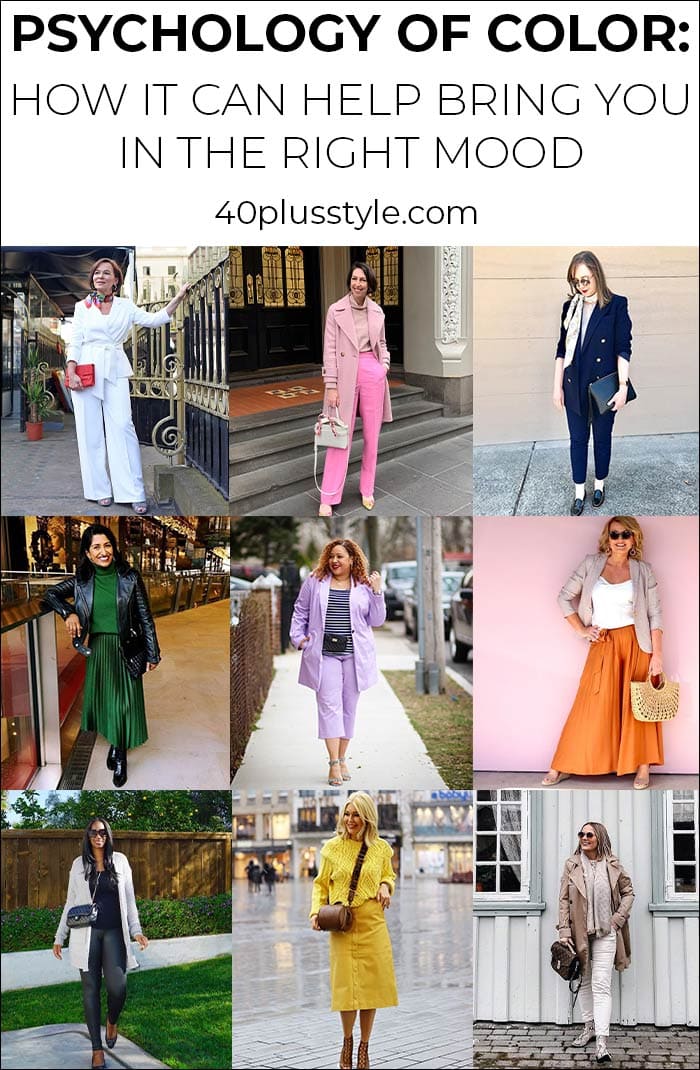
Like this article on the psychology of color? Save it on Pinterest!
Want to get more articles from 40+style in your inbox, subscribe here.
You can also connect with 40+style on Facebook, Instagram or Pinterest.
Support 40+style by using the links in our articles to shop. As an associate for Amazon and many other brands, we receive a small commission (at no cost to you) on qualifying purchases which enables us to keep creating amazing free content for you. Thanks!


I’ve never worn a great deal of colour because I was taught it is low class to do so. My best friend wears color and pattern. When shopping she has influenced me a bit to buy some color clothing. I still find classic colors to be more sophisticated and classy. I dress eurochic.
i cant remember my test for style. can you send it again please
i love your site
jude
Great to read you’re loving the site? Are you referring to this quiz? https://40plusstyle.com/fun-style-personality-quiz-to-find-out-your-dominant-and-secondary-style/
Great article. I know about the psychological effects colours have on us as I work in a creative profession, but I like very much your “wear if you want to feel…” tips. I often dream about clothes and colours and the way they suit me. One night I dreamt of a chequered coat in purple, white and black and found out later what the colours meant. It fitted my current mood exactly.
Colours are so important. I feel I want to dress more colourful but sometimes can’t get up the nerve to do it. I recently bought a pair of dark green pants which I really love but I am not quite sure what colour to combine them with. They are great, I just don’t want to look like a parrot.
Thanks for your articles, they are inspiring and informative.
I am a natural redhead, (now grayed); with extremely dry, white skin with a blue cast. I have always worn black with red or deep gray accents and silver jewelry. Since I turned 65, I’ve gone to more gray and some black with green or silver accessories.
This hasn’t been a conscious decision but evolved over time. The same reason I only purchase dark washed jeans over light blue and boat neck tops over standard tees these past few years. I think my style is more innate than thought out and I’m not sure if that is a good thing.
Lovely post. I do sometimes choose colours to reflect or influence my mood, but… I never like red or orange. I can actually feel myself tensing up when looking at red. I almost never wear it, but interestingly, sometimes I do because when it’s ON me, I don’t have to LOOK at it!
Ay, that’s not good. You would have a problem with me then, as I wear red quite frequently. I guess I have to take those reactions into account when wearing red…
I was just thinking about looking into the color meanings behind my sudden attraction to rust, dusty rose, pink, mauve, and burgundy. And here is your post (found via Heather)! Loving and earthy, with a soupçon of creativity + calm. Sounds spot on!
Very happy to have posted it right at the right time for you!
What a fabulous article Sylvia! Years ago I had a book on the meaning of clothes, and color theory was discussed in detail. I always found the link between black and death intriguing, especially because black is considered a sexy color as well. I will definitely be thinking about color when I get dressed this morning! Thanks for the tips.
I actually think that red is a lot sexier! Black to me is more elegant (and safe). Have fun thinking about colours!
Yes, colours do these things to your mind. I like cobalt blue and gold with lime green for the bedroom. Restful colours with an edge. And as you know our living room is very colourful. I like all kinds of reds (red, purple, orange.. etc) and green and yellow. Those are my favourite colours that suit my cheerful nature. So why am I always so drawn to black and white?
It cannot be because I reason or think black and white, as it is quite the contrary. Puzzled.
The trick is to just pair one of those colours with your black and white outfits. Then you have the best of both worlds.
I am 59 tomorrow, so well over 40. The menopause began for me at 39 and I started to put on weight after that, going from very slim to slightly heavy – up a dress size – in a couple of years losing all my confidence in clothes along the way. In the last few months since Christmas I’ve made a determind effort to get things together again before I hit 60. I go with a friend to the gym and walk as much as possible; also cut out all cakes, biscuits, desserts (may have one tomorrow) and kept to one glass of wine a day at most. Yes, I’ve started to lose weight, still a way to go, but feel more confident already. Hence – this week bought a shocking pink, slinky jersey, fitted wiggle dress I fell in love with in the shop, tried it on (not intending to buy) and realised my former pear shape had turned into hourglass. Read on this site that your shape can change at menopause and (even after losing weight) my boobs and shoulders now in proportion to hips; waist was always 12″ smaller than hips. Well readers, that’s one positive to come from all the painful changes. Coming back to colour – it HAD to be that PINK when I saw it, it just said feminine to me, not little girly, but grown up female woman – which I’ve not felt in years. Not sure where to wear it, but just having it in my wardrobe makes me feel attractive and puts a spring in my step.
Thank you for sharing your story with us Trisha and so happy to hear that you are back on track when it comes to your style and are feeling happy about your body again. Wonderful that you bought your hot pink dress and feel feminine in it. Of course I would love to see it, so feel free to share it with us either on my style forum or my facebook page!
The psychology of color is interesting to me, but I would have to consciously notice if I choose certain colors related to my feelings on any given day. I don’t know if it’s related or if I randomly choose whatever meets my gaze. Thanks for the challenge.
I think it’s interesting to note here what they generally mean and then you can reflect back at the end of the day (after wearing a certain colour), if that is indeed how the colour made you feel….
Im an art major so well versed in the psychology of color–but still love to be reminded! and you know how much I love color! My fave? yellow!
No surprise Paula. You are such a ray of sunshine!
This is a great post…I so appreciate this! I am strongly affected by color and have always stayed away from black clothes (and beige walls in my home). I’m just happier wearing cheerful colors and living in bright, happy rooms. Just the other day I wore a gray sweater over a purple blouse with jeans and blue sparkly AGL flats, and by the end of the day, I had to change into a bright yellow sweater to pick up my mood. I view black as a complete lack of color, as the pigment completely absorbs all light in the visible spectrum and doesn’t reflect anything back. A visual “black hole”, if you will. Creams/tans are my go to neutrals and the rest of my closet looks a bit like a box of secondary and tertiary skittles exploded. 🙂 I’m going to share this post since it captures what I’m always trying to share with my friends. Thanks for stating it so well!
I have always loved colour but for my clothes was still drawn to neutrals. I’m fully embracing them now and feel so much better! It sounds like you are using colour to great effect Rita. And thank you for sharing the article!
This post is just what I needed. My husband lost one of his dearest friends this week and we have a funeral to attend. The weather is gray and bitterly cold, our hearts are broken, everything feels heavy and sad – even the air. I have not worn anything but black or gray for two days and was planning on wearing black to the service but now I am thinking I might wear blue instead. Not a summery blue but a deeper sapphire shade. I need the reminder that there is some light in every darkness.
This article is well researched Sylvia. You always put so much effort into your articles. Your readers truly appreciate it.
I’m very sorry about the death of your husband’s friend, Suzanne. I think a sapphire blue is a perfect color. When my dad passed away (9 years ago today, in fact) I wore a pink twin set with a black skirt. He always laughed when he saw my bright pink sweater set so I figured it was an appropriate tribute. I actually had several people compliment me after the service and said if they had known I was going to wear pink, they’d have worn something more cheerful, too, since my dad was kind of a jokester. I hope the service for your friend is a lovely tribute.
Similarly I wore a pretty purple dress to my Grandmother’s funeral because she and I both loved purple. At first her daughter acted like it wasn’t appropriate but then she stopped and said ‘No, Mom would have loved it”. I thought so too. It was in honor of her and it did lighten up things a little bit.
Wishing you and your husband lots of strength in these difficult times Suzanne….
Thank you both for your warm wishes and support. We are doing better. We received a LOT of snow overnight and have spent all afternoon digging out. The exercise and fresh air was good for us. 🙂 Along with our “veggie” tea to warm us up! LOL!
Happy you had a good day, Suzanne, and that all those veggies helped. 🙂
I love this post too. Colour is so important, how you mix a colour and also the quantity of one colour next to another makes a huge difference too. Experiment is the secret to successful colour co-ordination and lots of fun along the way.
Yes, it’s a lot of fun. I still need more coloured garments in my wardrobe to play with. Saw some beautifully coloured graphical dresses at CK Calvin Klein today #tempted
Although they say that everybody can wear red as long as it is the right shade, I have always had a problem wearing it as I feel it draws too much attention. However, I had to lead a conference once and bought a red dress and felt very confident in it. I am currently thinking of buying a yellow cardigan as I am doing some designs!
Red certainly does draw a lot of attention but that should be a good thing, right?
I love this so much I just added a link to it in my blog post for tomorrow!
Thanks!
Great post! I have to say that if i am feeling down I purposely choose to dress cheerfully in hopes it will change my mood. I have done this since my teen years. I also dress with more color on rainy and cloudy days.
Well done to you Tracey. Sometimes not so easy to do!