
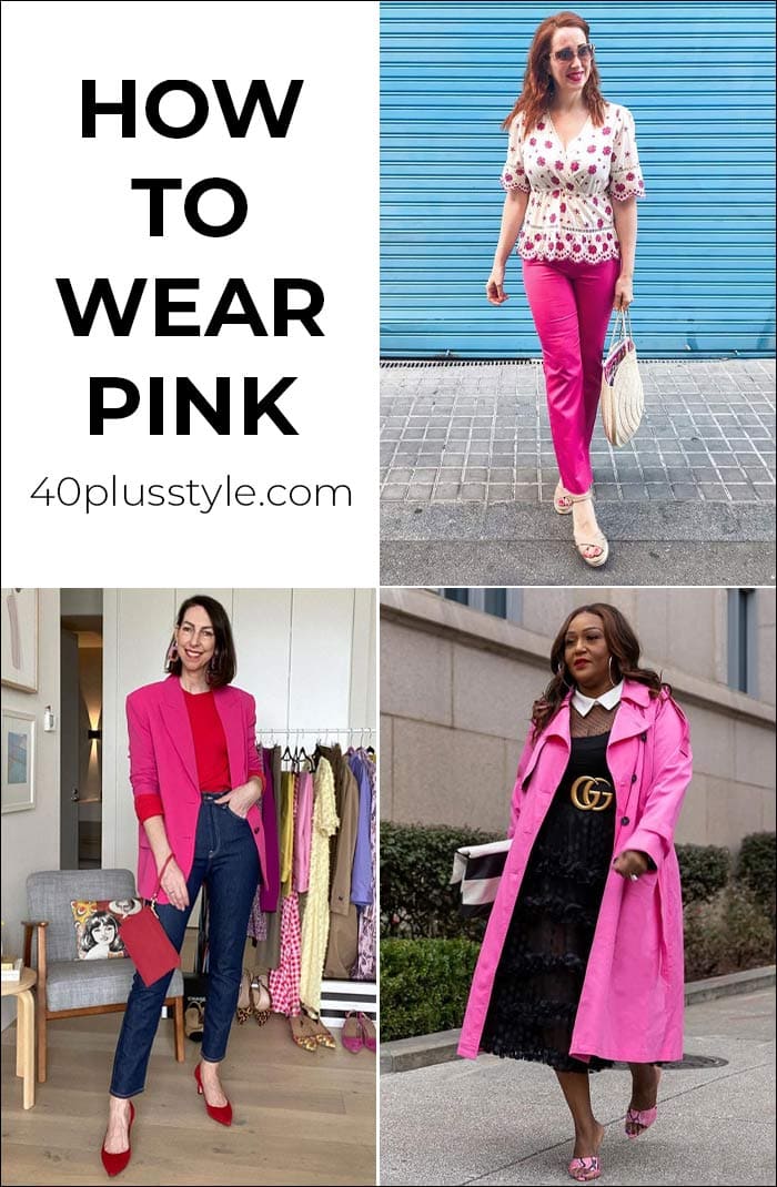
Pink is one of those colors that divides opinion. You probably either love to wear it, or never wear pink at all. However, if you’re wondering how to wear pink so you look sophisticated rather than girly, there are plenty of ways to wear it in a chic and stylish way, whether you choose a pale pastel shade or a bright shocking pop of pink.
Wondering how to wear pink this season? Let’s discover many fabulous ideas below with some pink outfits for women that should inspire you – and the best colors to wear with pink!
How to wear pink this season
Pink never really goes out of style, and it’s actually particularly on trend for the upcoming Fall 2020 season. While it may be associated with summer, designers showcases everything from pale baby pinks to peachy shades and shocking pinks on the runways.
Let’s show you how to wear pink and create fabulous outfits with this color!
Why wear pink?
If you haven’t worn pink at all, or you don’t think it’s for you, it may be worth reconsidering.
Pink can be universally flattering, especially a rose hue, which does not wash out lighter skin tones or contrast too harshly on darker skin tones. It actually warms your skin tone and makes you look healthier, which is an exciting characteristic to play with.
Why is pink seen as a challenging color?
Often times, especially as we get older, we tend to shy away from wearing pink.
We either refuse to come across as if we’re playing princess or just feel that the look is too frilly and girly.
But, wearing pink can be a successfully chic route to take. The key is to treat it like a warmer neutral with endless color, texture, and print combinations.
Pink outfits for women: The best pink pieces in stores now
First, let’s take a look at some of the chicest pink clothes in stores now. Then, we’ll take a look at how to wear your pink and what colors go best with this shade.
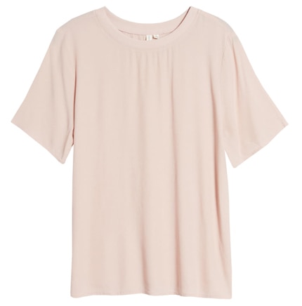
Pink t-shirt
A pink t-shirt can be just as easy to wear as a neutral shade like white or gray. This tee from Treasure & Bond (below) has a looser cut for a casual feel. You could wear under a black, navy or white blazer for a smart feel, or casually with jeans and sneakers.
The sleeves are slightly longer than on many t-shirts so if you like to cover your arms, this could be a good option.
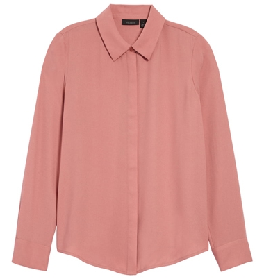
Pink blouse
A pink blouse can be a stylish option for either work or for the weekend. This blouse from Halogen (below) in a deep rose pink could easily be tucked into high-waisted wide pants or a pencil skirt or you could wear loose over leggings.
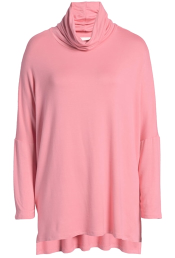
Pink tunic
A pink tunic could be a good choice if you are looking for a top to wear over your leggings. There are more ideas in this article on how to wear leggings over 40.
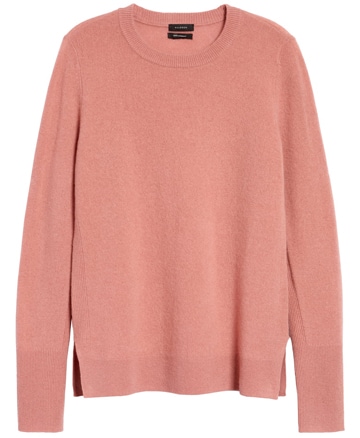
Pink sweater
A soft pink sweater can be a beautiful choice as the weather starts to turn colder. You could simply wear with your blue jeans. Or, I also saw pink teamed with olive green and with beige on the designer runways for fall 2020. The sweater (below) from Halogen is made from soft, cozy cashmere.
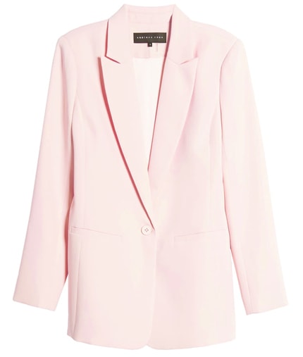
Pink blazer
I’m sure you already have a blazer of some description in your closet. But how about a pink one like the Endless Rose blazer below? You could wear with a column or black or navy underneath for an elongating, slimming effect, or just pop over a pair of jeans and white t-shirt.
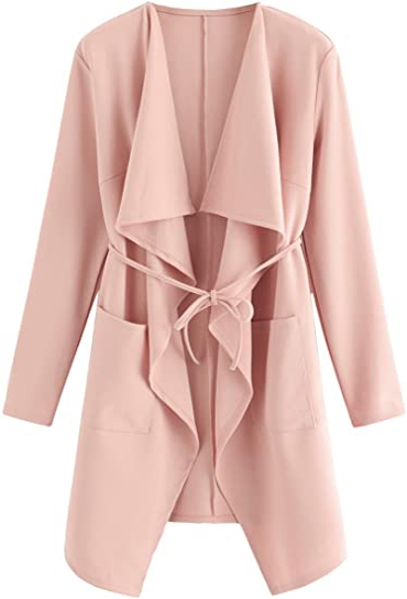
Pink coat
Another pink coat option could be the flattering, draped, waterfall style below from Romwe. This is a lightweight jacket, so a good choice for transitional weather as we move from summer through to fall.
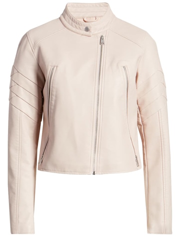
Pink moto jacket
Or, how about a moto jacket in pink? While we normally associate leather moto jackets as being black, choosing a pink moto such as this faux leather style from Levi’s (below) could bring an unexpected touch to your outfit.
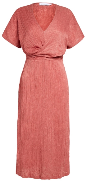
Pink dress
A wrap style dress is universally flattering, and this plissé dress from All in Favor (below) could be a great alternative to your little black dress.
Pink jeans
While you probably have black, blue and white jeans in your closet, a pair of pink jeans such as the 7 for All Mankind skinnies (below) could be a good addition. You could style them in exactly the same way you do your white jeans for summer. Or how about adding a gray sweater for cooler weather?
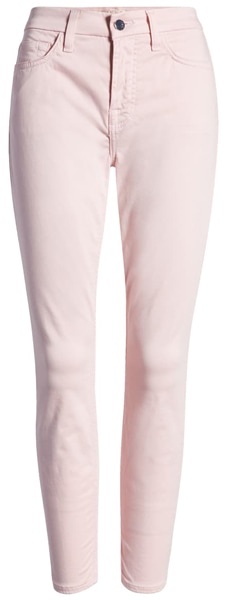
JEN7 by 7 For All Mankind skinny jeans
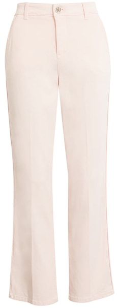
Pink pants
If you prefer wearing pants to jeans, these Wit & Wisdom ankle pants (below) are super flattering as they have power-mesh panels to hold your tummy in, as well as “booty-lift” construction – so you should look great from any angle!
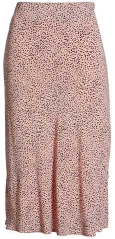
Pink skirt
While animal print may traditionally come in shades of beige and tan, you could try the Rails midi print skirt (below), which would look lovely dressed up with heels for dinner, or with a t-shirt and sneakers for a more casual look.
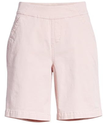
Pink shorts
It can be tricky to find shorts that are just the right length. The Jag Jeans shorts (below) come in a flattering mid-length, and are available in neutrals as well as this pink shade.
You’ll find more flattering shorts for women over 40 in this article.
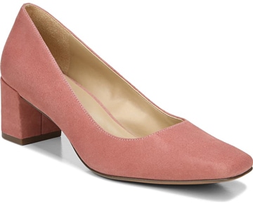
Pink shoes
Changing your shoes is an easy way to update your outfits. You could add a pop of pink to neutral outfits in your closet. These Naturalizer pumps (below) have an on-trend square toe and would look great teamed with black, navy or white.
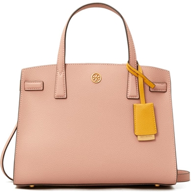
Pink handbag
If you’re more of a bag person than a shoe person, you could update your looks with your handbag. This Tory Burch tote is in a classic style, but an unexpected color.
Other pink accessories
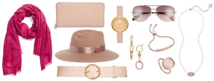
Nordstrom cashmere & silk scarf – Kate Spade New York zipper wallet – Nordstrom satin trim wool hat – Rachel Parcell leather belt – Tory Burch leather strap watch – Kate Spade New York aviator sunglasses – Gorjana link drop earrings – Monica Vinader chain bracelet – Monica Vinader stone stacking ring – Kendra Scott pendant necklace
7 tricks to wear pink in style
Now that you have taken a look at some of the pink pieces in stores at the moment, here are our tips to guide you as you dive into the color which has been bang on trend for the last few seasons, and continues to be popular.
1. Add texture
If you’re wondering how to wear pink and make it easier, add a bit of texture.
Texture always gives pink a little edge and adds visual interest that immediately makes a look more chic and multi-dimensional.
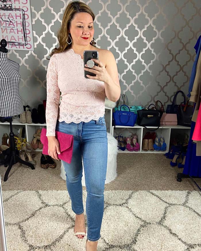
Suzie (above) adds texture to her style with her lace on-shouldered top. She also adds modernity to her outfit by mixing her shades of pink and adding a hot pink bag.
Recreate her look with this similar lace blouse, jeans, sandals, clutch and earrings.
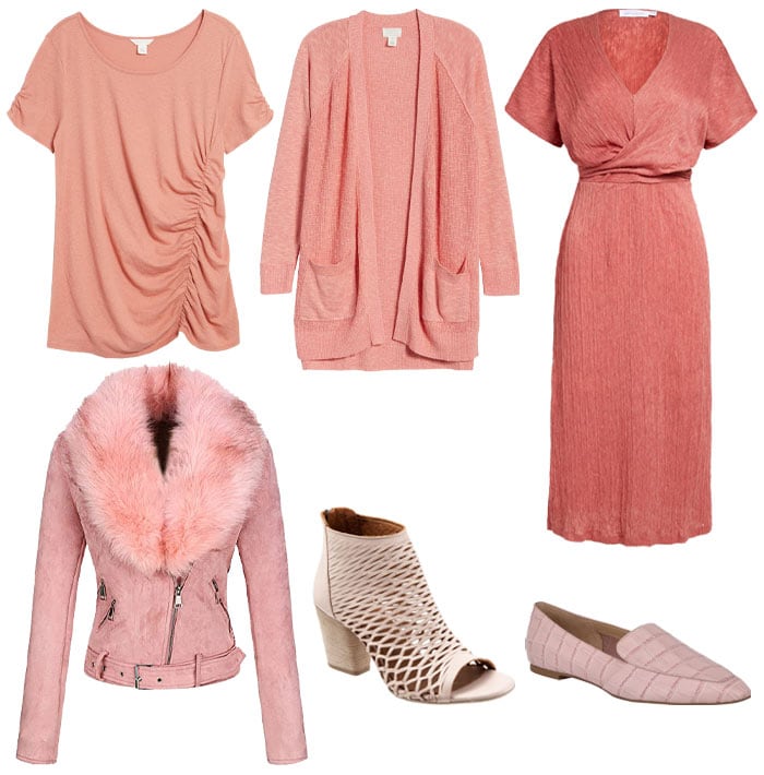
Caslon ruched t-shirt – Caslon open fron cardigan – All in Favor midi dress – Bellivera suede jacket with detachable faux fur collar – Bueno cutout peep toe bootie – Marc Fisher LTD square toe loafer
2. Go for contrasts and prints
Prints and contrasts are effortless ways to add more complex tones to your look without having to add too much more to your ensemble.
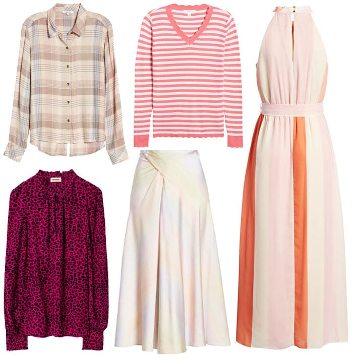
Splendid Sanctuary plaid shirt – 1901 scallop trim sweater – Julia Jordan halter maxi dress – Zadig & Voltaire leopard print blouse – Vince Rainbow drape skirt
3. How to wear pink: Be inspired by menswear
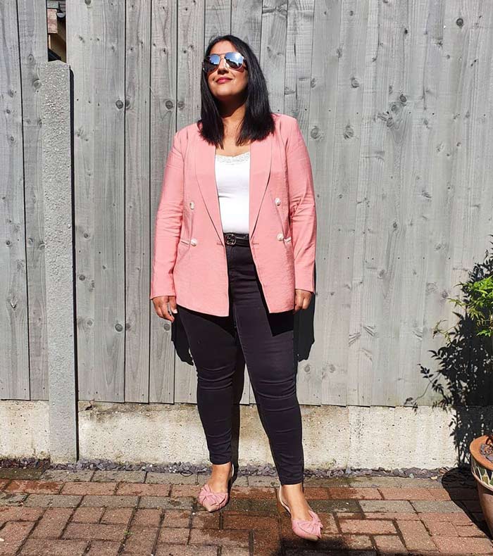
Pink is a very feminine and pretty color which van feel too girish for women.
Therefore a great trick is to go for really masculine styles to counterbalance the girlishness.
A very interesting and chic visual juxtaposition is to select pieces with menswear-inspired cuts and silhouettes.
This allows you to downplay the softness of the pink, and still allows you to wear larger pink pieces.
Jas (above) wears a double-breasted, menswear-inspired blazer with her jeans. But she also adds a feminine touch with the bows on her shoes.
Get her look with this similar blazer, jeans, flats and sunglasses.
Doublju basic slim fit shirt – Vince Camuto satin utility shirt – Significant Other minidress – HUDANHUWEI wide brim fedora – Blackstone loafer
4. Use pink as an accent
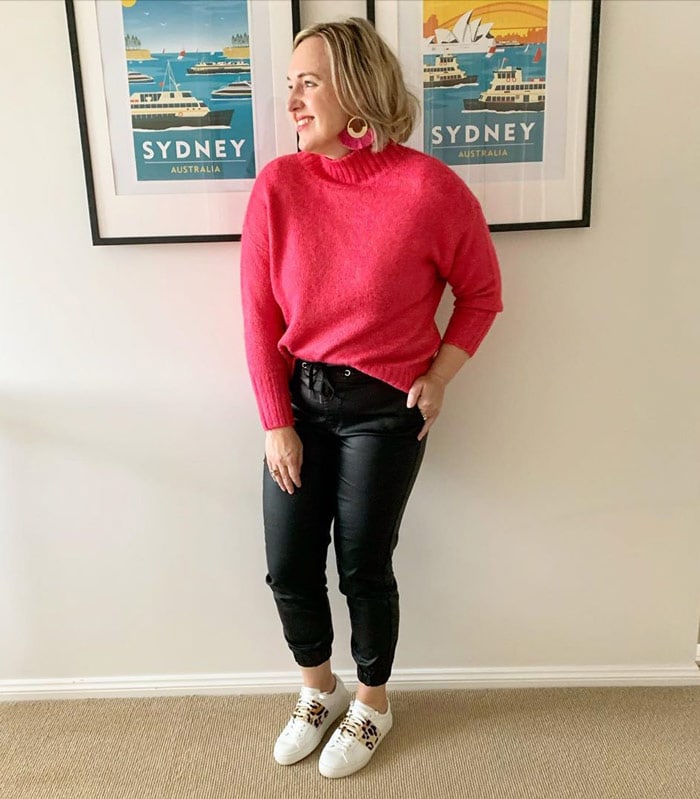
You can also use pink as an accent for a look.
From single pink accessories (like sunglasses) to its use as a subtle color, adding touches of pink is the perfect way to add a feminine highlight to your look.
Kylie (above) opts for a pair of pink earrings to provide the finishing touch for her look.
Check out this similar sweater, pants, sneakers and earrings.
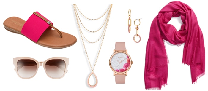
André Assous sandal – Rebecca Minkoff cat eye sunglasses – Ettika multistrand pendant necklace – Gorjana link drop earrings – Timex crystal floral watch – Nordstrom cashmere & silk wrap
5. Toughen it up
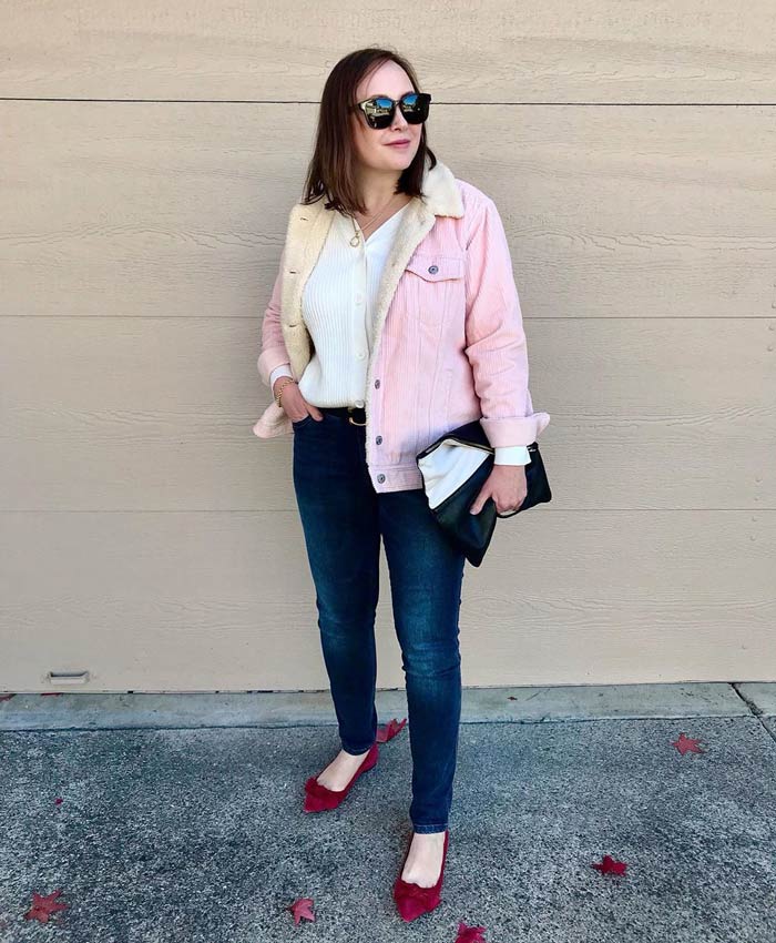
Similar to choosing more masculine styles, you can also opt for tougher fabrics to wear pink..
The look comes across as romantic with a little edge.
It is also a fun way to incorporate a bit of a rocker tone into your look. Look for pieces with studs and buckles, or opt for a biker jacket in pale pink.
Oxana (above) chooses a “trucker” style shearling demin jacket and softens the look by choosing a shade of pink rather than traditional denim blue.
Check out this similar cardigan sweater, denim jacket, jeans, flats, clutch, necklace and sunglasses.
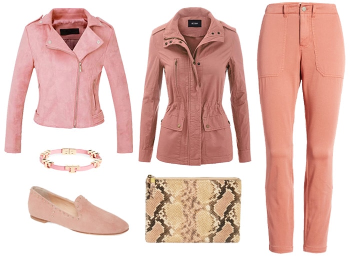
CHARTOU suede moto jacket – FASHION BOOMY military jacket – Madewell crop utility pants – Tory Burch wrap bracelet – AGL studded loafer – Madewell snake embossed clutch
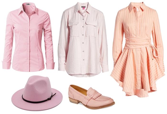
6. How to wear pink: Go classic
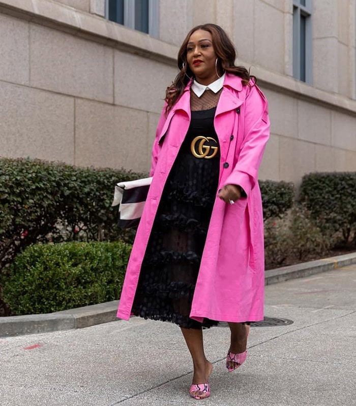
Wondering how to wear pink but you don’t want to go too masculine or tough since your style is more classic?
Another way to reduce the “princessy” element of pink is to opt for a very chic, classic style, such as choosing a trench coat in pink, rather than the traditional beige.
Nikki (above) opts for a shocking pink trench in a very classic shape.
Check out this dress from ASTR the Label that you can wear with this Gucci belt, similar coat, sandals, clutch and hoop earrings.
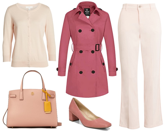
1901 cotton blend cardigan – Wantdo double breasted trench coat – Wit & Wisdom ankle trousers – Tory Burch leather satchel – Naturalizer square toe pump
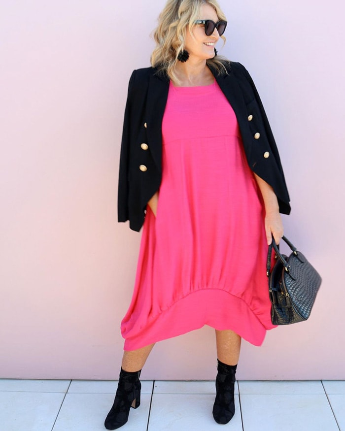
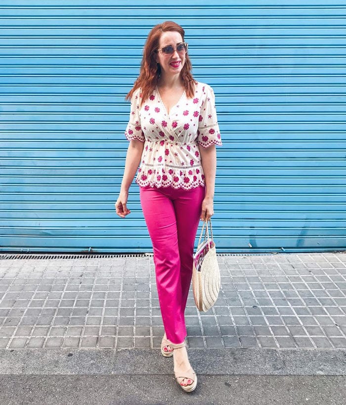
7. Bright and bold: Hot pink clothes
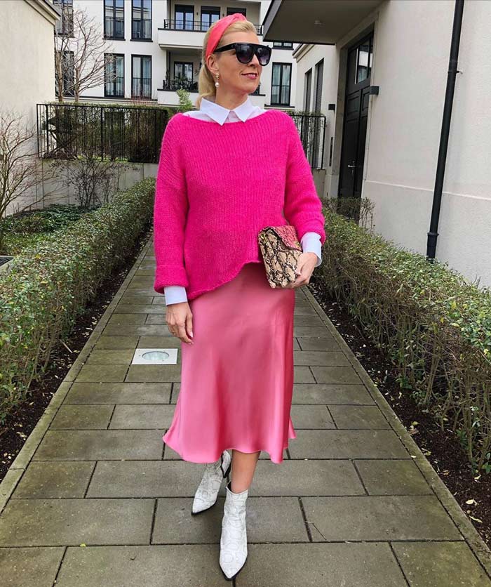
Of course, not all pink has to be soft.
If you opt for bright pink, you can let one bold, pink piece do the talking and keep the rest of your outfit low-key or you can mix your pinks to make a bigger statement.
Nadine (above) opts for three pink pieces in her outfit and teams with snakeskin booties.
Steal her look with this similar shirt, sweater, skirt, booties, clutch, earrings, sunglasses and headband.
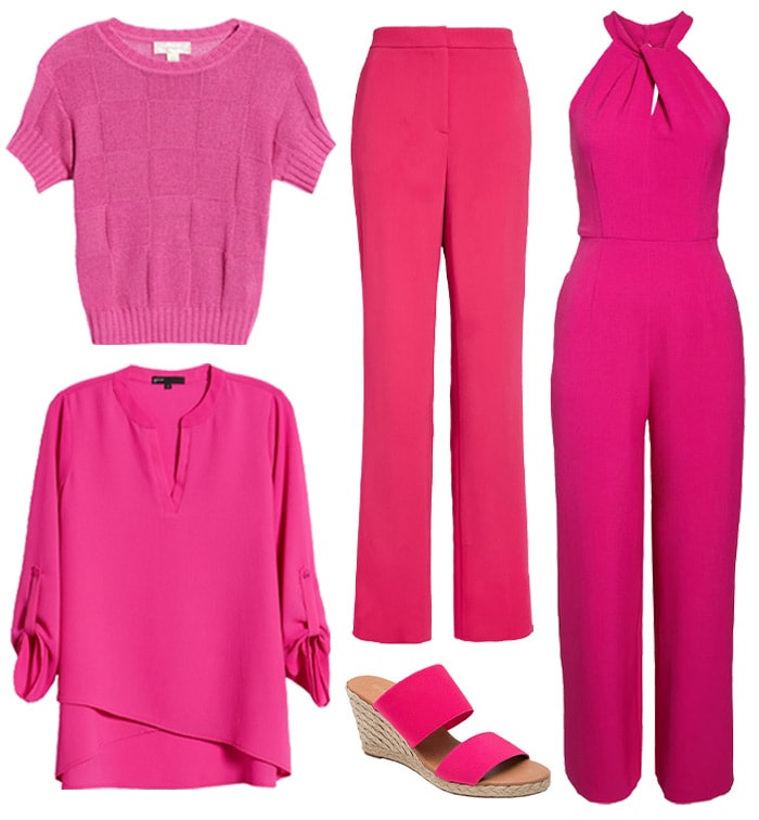
Band of Gypsies sweater – Gibson cross front tunic top – St. John high waist pants – André Assous wedge espadrille sandal – Julia Jordan halter neck jumpsuit
What color goes with pink
If you are looking for inspiration on what colors to wear with pink (or any color for that matter), then colourlovers is a good place to try. You can search for palettes and then create outfits using your favorite shades.
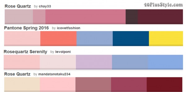
Color combinations that go with pink
Take a look below at some of my favorite ways to wear pink. I’d love to hear your favorite color combinations. You can let me know in the comments at the bottom.
Black and pink outfits
If you really don’t want to look too girly, then wearing your pink with black is a good choice. You can wear black with any shade of pink and it immediately gives your look a more “grounded” appearance rather than being overly romantic.
Bev (above) wears her pink dress with a black blazer and booties as well as black accessories.
Check out this similar dress, blazer, booties, handbag, earrings and sunglasses.
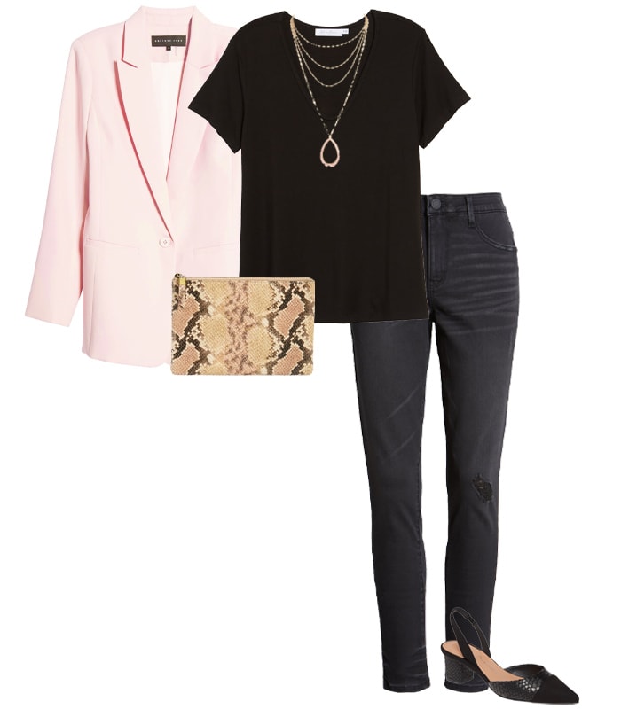
Endless Rose blazer – All in Favor t-shirt – Wit & Wisdom skinny jeans – Chinese Laundry slingback pump – Madewell snake embossed clutch – Ettika multistrand pendant necklace
Pink and red outfit ideas
It’s good to try something a little unexpected, and pink and red aren’t necessarily shades you might think about putting together. While wearing pink and red in the same outfit may once have been considered a fashion faux pax, it’s now a very on-trend combination.
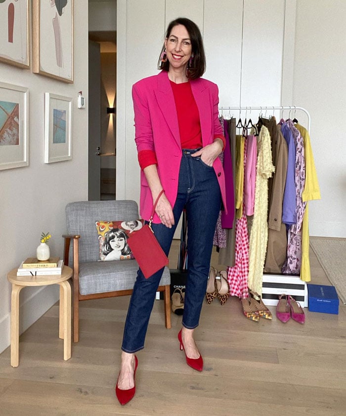
Sally (above) looks fabulous in her red top and pink blazer, which she matches to her shoes and handbag.
Recreate her outfit with this similar sweater, blazer, jeans, pumps, purse and earrings.
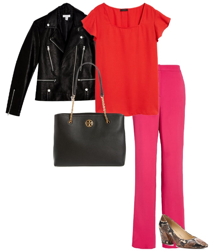
Halogen flutter sleeve top – St. John high waist pants – Topshop faux leather biker jacket – Botkier block heel pump – Tory Burch leather tote
Pink and white outfits
An easy, fresh combination to put together, particularly for summer, is pink and white. You can either keep your whole look soft and tonal by opting for a pastel pink, or you can create a punchier look with bright pink and crisp white.
Patricia (above) wears her pink pants with a matching top (and toe nails) and keeps the rest of her look neutral.
Check out this floral blouse from Lucky Brand and wear it with this similar pair of pants, sandals, handbag and sunglasses.
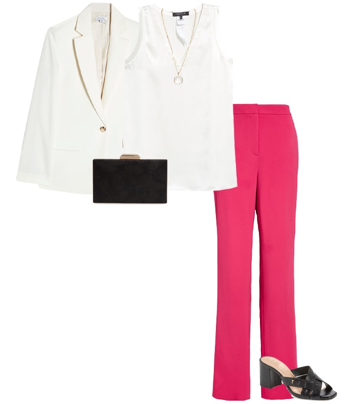
Topshop crepe blazer – Lafayette 148 New York silk blouse – St. John high waist pants – Ted Baker London sandal – Nordstrom minaudière – Kendra Scott pendant necklace
Pink and yellow outfit
Another unexpected combination, but one that can definitely work, pink and yellow is perfect if you want to stand out from the crowd.
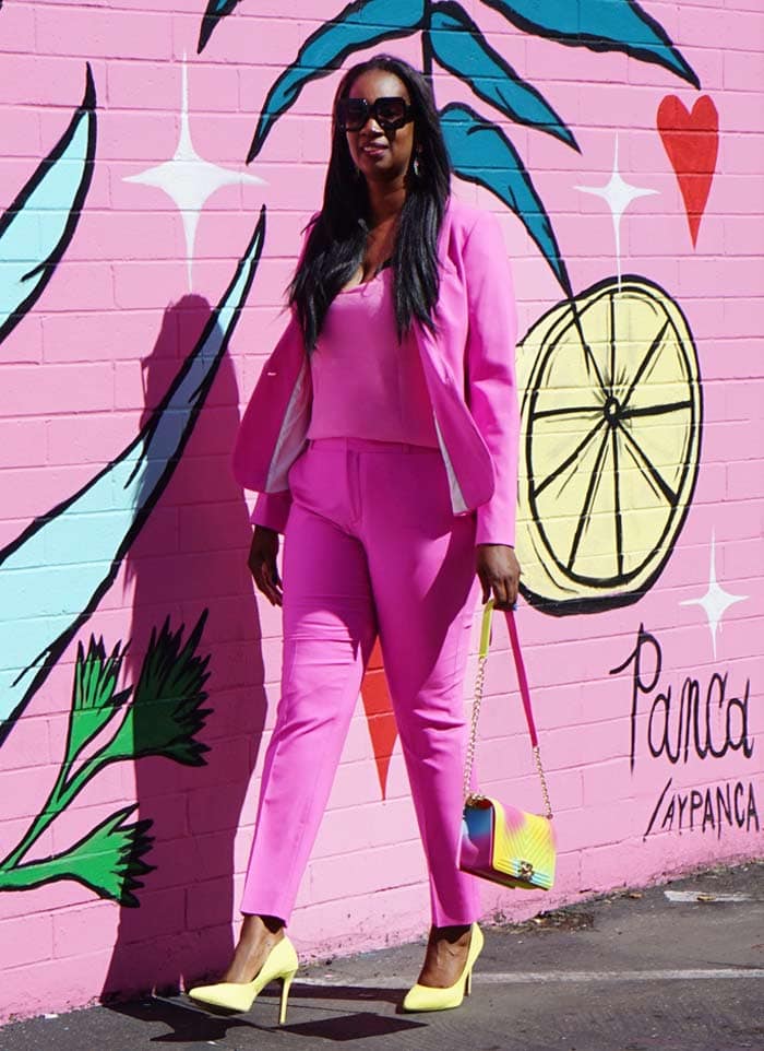
Tanasha (above) wears a pink pant suit and styles with yellow accessories (and a pink wall!)
Check out this similar top, blazer, trousers, pumps, handbag and sunglasses.
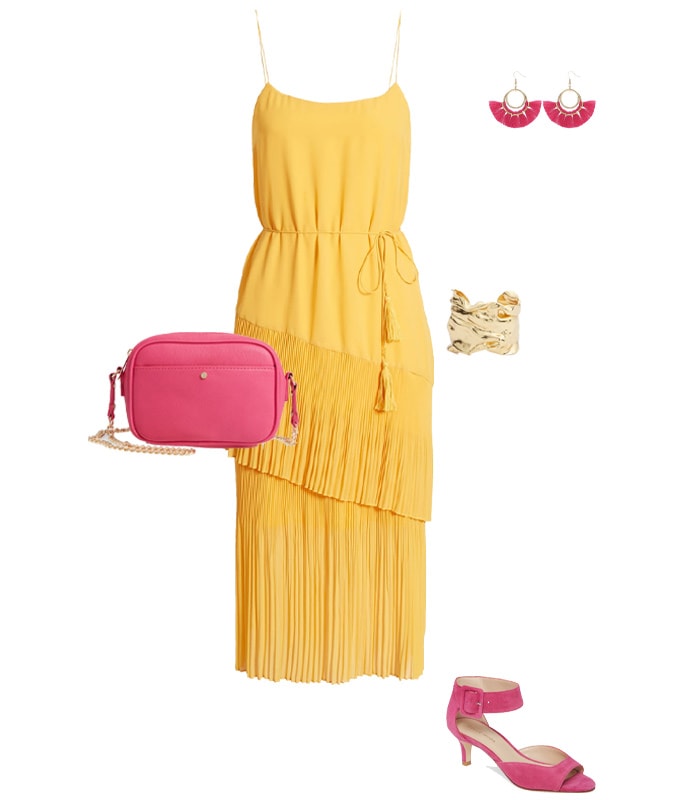
Chelsea28 ruffle tie waist midi dress – Pelle Moda ankle strap sandal – Mali + Lili vegan leather camera bag – BaubleStar tassel earrings – Karine Sultan cuff
Pink and grey outfit inspiration
A softer, beautiful combination can be to team pink and gray. Because gray as a neutral doesn’t always make a huge impact on its own, this allows the pink parts of your outfit to stand out.
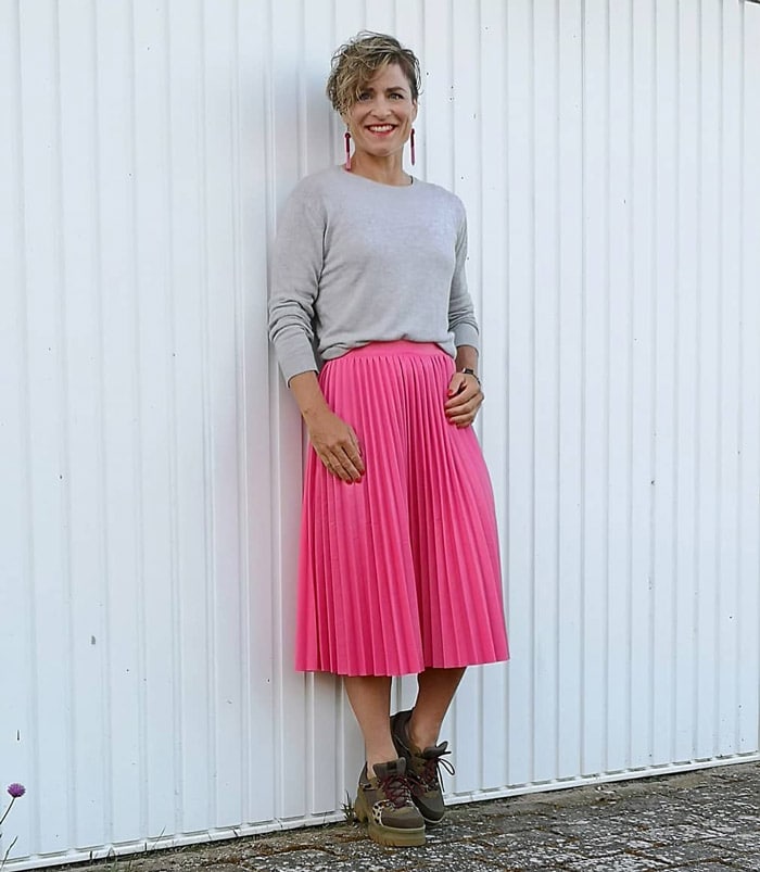
Gitte (above) chooses a soft gray sweater to wear with her pleated pink skirt, and keeps her look casual by adding platform-heeled sneakers.
Get her look with this similar sweater, pleated skirt, shoes and earrings.
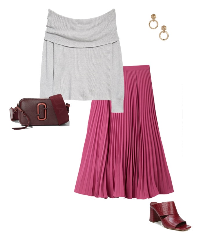
Leith off the shoulder sweater – Boden pleated skirt – Vince slide sandal – MARC JACOBS leather crossbody bag – ALLSAINTS drop earrings
Want to discover the right color pink for you?
Has this changed your mind about wearing pink? Or given you some food for thought when it comes to wearing the pink clothing your already own?
How do you wear pink and what’s your favorite pink color combination?
Continue reading:
- How To Wear Red – Your Comprehensive Guide On Wearing The Color Of Love!
- How To Wear Gray: Color Palettes And Ensembles For You To Choose From!
- A Capsule Wardrobe And Style Guide For The ROMANTIC Style Personality
Like this article on how to wear pink? Save it on Pinterest!
Feature image by Nikki
Want to get more articles from 40+style in your inbox, subscribe here.
You can also connect with 40+style on Facebook, Instagram or Pinterest.
Support 40+style by using the links in our articles to shop. As an associate for Amazon and many other brands, we receive a small commission (at no cost to you) on qualifying purchases which enables us to keep creating amazing free content for you. Thanks!
Sylvia, please let us know where to get these great components in the pink and back shot: https://40plusstyle.com/wp-content/uploads/2015/02/blackalineskirt-6-of-6opt.jpg
Thanks!
Enid
Top is from In Good Company https://ingoodcompany.asia/ Skirt is old and from a small boutique. Shoes also a few years old and don’t know the brand (don’t have them here currently).
Sylvia, you are absolutely brilliant with your color combinations, and your individual styles. I look forward to seeing your unique, and beautiful outfits!!!
So I love some of the looks you posted. Where do I buy them?
All items that are still available online are listed in the shoppable boutique above.
I love it when you add colour combination bars… I will have to come back to this post and read it more carefully. So little time at the moment.
Very interesting. Thanks Sylvia.
I have traditionally steered away from pastels in general but Rose Quartz pink really flatters my skin. I already own an Ann Taylor sweater in this shade and I will consider shopping for a top, scarf or other accessories to pair with the clothes I own. Thank you for the color palettes and outfit examples, Sylvia. Lots of inspiration to work with!
fabulous suggestions. I really like #2 “go for contrast and prints”. Some colors in large doses are not flattering but they usually can be worn as part of a pattern, especially florals.
http:/finewhateverblog.com
I agree, but a little pop of bright color can look really nice!
you wear pink in a very cool and chic way! fantastic!
i really like the yellow&pink versions! yellow is a great summer color – but usually not on me. so wearing it with a very flattering pink kills to birds with one stone for me :-)))
thank you!
xxxxx
two – like 2! ts. 🙂
You’re welcome. I think pink with bright yellow can be very chic!
I love pink being a summer color type. But it took me quite some time to accept 😉 Anyways, just got myself a pink coat for spring and having no difficulties styling it your ideas here (yellow! blue shirt!) are really inspiring. Love that. Yellow is a color that is not easy. I was wondering if you already did anything on yellow and orange for summer types. With orange being the new black I find that quite challenging because orange will make me look weird. Any advice? Skip it all together? Sabina
I have 2 older articles on these:
https://40plusstyle.com/how-to-wear-yellow/
https://40plusstyle.com/how-to-wear-orange/
Will need to update these….
Hi Sylvia, your combination are great!
Congratulations for your style.
Would you like to see my pink combination?
http://notonlytwenty.com/2016/02/pink-again/
Wow that is amazing Rita. What a fabulous coat and necklace!
I can’t wait to get a bright pink bag to style with burgundy and blue. And with pink in the air, I would love to try a pink blouse with trousers and heels for spring.
Thanks for sharing these styling looks.
http://www.beastofstyle.com
Have fun styling Silvia!
I love pink but have been shying away from it as I’ve been getting older. But your outfits clearly show that it can look great! All your outfits look amazing, and I like especially the white jeans with the pink sweater! So chic!
I did recently buy a purse in rose, and I love it. Now I’m inspired to try some clothing and/or more accessories. I’ll also play a bit with the Pantone Spring 2016 color pallette. I like your outfit possibilities based on it.
Thanks Andrea. Yes, pink has become quite a versatile and popular color in my wardrobe!